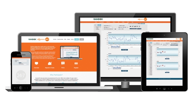

Interlaboratory Data Management - Acusera 24.7
Acusera 24.7 is an interlaboratory data management programme designed to complement and support the Acusera range of internal quality controls.
Randox offer two separate solutions for participation in Acusera 24.7:
- Acusera 24.7 Live Online
- Acusera 24.7 Live
Both solutions enable laboratories to monitor analytical performance, interpret QC results, access peer group reports and compare results with other laboratories using the same quality controls and often the same method and instrument.
Why participate in a peer group reporting programme like Acusera 24.7?
- Identify any trends, system errors or reagent issues as soon as they arise
- Improve EQA/PT performance
- Help gain accreditation and meet regulatory requirements
- Minimise false rejections and maintain high error detection using QC multi-rules
- Have confidence in assigned target values
The new Acusera 24.7 Live Online offers the following key benefits:
Peer group data uniquely updated every 24 hours
- Real-time comparison of data from thousands of laboratories worldwide
- Useful for troubleshooting test performance and may even help to identify issues sooner
Web based meaning no installation required
- Online access anytime, anywhere
Exceptional connectivity
- Automatically import QC data direct from your laboratory’s instrument, or LIMS via Acusera 24.7 Connect
Simple and intuitive user interface
- A unique dashboard interface is displayed upon logging in bringing any QC tests which have fallen outside performance limits in the last 7 days to the users attention
- Colour coded results for easy identification
- Advailable in multiple languages
Fully interactive Levey-Jennings and Histogram charts
- Combine multiple control lots and/or parameters on a single chart
- Add actions or comments for advanced data review
Comprehensive Reports
- A comprehensive range of report formats are available enabling exceptional data analysis and review
- Secure audit trail report records all actions providing an effective method of documenting review
Report & Charts
 Dashboard interface provides a rapid indication of poor performance

The dashboard interface is a pre-defined homepage that is automatically displayed each time a user logs onto the software. The dashboard instantly brings any QC tests which have fallen outside the user-defined performance limits in the last 7 days to the user’s attention and provides an indication of any poor performing tests that require further investigation.
 On Screen Summary of Results

The on screen summary of results provides users with a visual overview of current analytical performance. Acusera 24.7 Live Online will automatically calculate statistical data, including the mean and standard deviation. Data is presented in an easy to read format allowing any sudden or gradual changes in performance to be identified immediately.
The summary provides both monthly and cumulative data and enables comparison to a user defined fixed mean and standard deviation. Each laboratory can set fixed values based on peer group statistics or other values such as the target and range quoted for the particular lot of control material in use.
Results which are outside acceptable limits of performance are highlighted in orange for ‘alert’ and red when ‘rejected’ allowing for quick and easy identification. The system also provides users with a reason for the poor performance and indicates which rule has been violated. Users may add comments or actions enabling advanced data review.
 Interactive Levey – Jennings Charts

Identify trends, bias and precision problems at a glance using the fully interactive Levey-Jennings charts. Two types of Levey-Jennings chart are available, one based on the standard deviation and the other based on percentage CV. Each chart provides an instant visual indication of whether or not a test is performing well.
Using the unique overview bar, laboratory staff can scroll through past data to look at previous trends or zoom in on a specific time period providing them with a more in depth look at performance. The interactive nature of the chart allows users to add actions or comments, for advanced data review. The date and deviation from the mean is easily displayed by hovering over any of the data points, further information including the actual result obtained can be accessed simply by clicking on each individual data point. Depending on their preference users may choose to hide either the data points or the daily mean line.
 Interactive Multi Levey - Jennings Chart

Combine multiple levels of control and or multiple parameters on the same chart. Multiple data sets can be generated by simply combining results from multiple parameters, instruments or lot numbers on one easy to interpret chart.
The ability to combine data for multiple levels of quality control on a single Levey-Jennings chart enables users to see if the same level of bias or the same trends are seen with more than one level of control. Whilst the ability to combine multiple parameters on the same chart enables users to check if the same level of bias or the same trends are seen across different parameters.
 Interactive Histogram Charts

The histogram displays your monthly mean for each parameter allowing any long term trends to be identified and corrected as soon as possible.
Like the Levey-Jennings chart the histogram can be based on either standard deviation or percentage deviation and provides a visual representation of a laboratories performance. The histogram chart is extremely useful in identifying both shifts (abrupt changes) and trends (gradual changes over time) in your monthly results. Each bar on the chart represents a single calendar month.
Like all charts the interactive nature of the histogram means users can zoom in on a specific month or time period for a more in depth look at performance.
 Display data for multiple levels of control and/or parameters on the same histogram chart

Users can choose to display data for multiple levels of control and or multiple parameters on the same histogram chart. The ability to display multiple data sets on a single chart enables laboratories to determine if the same shift in control values is seen between different levels of control or with more than one parameter.
Like the Levey-Jennings charts actual data can be displayed by simply hovering over the bar relating to the month of interest.
 Peer Group Statistics

Using 24.7 Live Online you can select the peer group statistics to which your results are compared.
Several options are available:
- All methods
- Method
- Method / Reagent
- Method / Instrument Model
- Methods / Instrument Model / Reagent
- Method / Instrument Group
- Method / Instrument Group / Reagent
The peer group may be changed at any time and data can be viewed on the same screen allowing for easier troubleshooting. 24.7 Live Online peer group data is updated every 24 hours giving you access to the most up to date information available. This service is unique to Randox Acusera 24.7 Live Online.
Peer group data can be customised so that laboratories can compare their performance either to their peers worldwide (world statistics) or to their peers in a selected affiliate group (group statistics). Group co-ordinators can view the performance of others in their group of affiliate laboratories.
 Audit Trail Report

Providing high-quality statistical process control
The Audit trail report is a secure; computer generated electronic record showing all events relating to the creation, modification and deletion of an electronic record.
The event list contains all auditable events that have been performed including date, time, lot, instrument ID, test, expiry, initials of operator, original value/setting, new value/setting and any comments entered.
Regulatory bodies frequently require laboratories to document review of their QC data. Actions, comments and audit trails when used in combination provide laboratories with an effective way of documenting this.
 Laboratory Performance Overview Report

Performance summary charts allow cumulative and monthly data to be compared to a peer group based on world or affiliate group results.
The performance summary report highlights potential bias and imprecision issues, displaying your SDI on the y-axis and your CVI on the x-axis. Your laboratories performance versus your chosen peer group and method peer group are plotted. Your cumulative or monthly results can be compared to world or affiliate group statistics enabling enhanced trouble shooting capabilities.
Analytical performance can be quickly and easily interpreted by identifying where your result falls in the shaded region.
Laboratory Comparison Report
The laboratory comparison report is available to laboratory groups or chains and enables results to be compared to those of their peers or method consensus group
Method, instrument and group statistics are provided for each lot of control in use and each parameter tested. The report includes many vital statistics including the mean, Standard Deviation (SD), Percentage Coefficient of Variation (%CV), Standard Deviation Index (SDI) and Coefficient of Variation Index (CVI).
The laboratory comparison report is available on request at the laboratories desired frequency
Exception Report
Allows large laboratory chains or groups to view all analytes that exceed the pre defined SDI/CVR
The exception report is ideal for quality control coordinators or laboratory managers who manage multiple laboratory sites or multiple instruments of the same make and model.
The report is available on request and lists any analyte that exceeds the specified SDI or CVR warning limits compared to the consensus groups. Any analyte rejected by Acusera 24.7 Live Online is also listed for all laboratories within the affiliated laboratory group. Laboratory managers may choose the frequency of the report.

